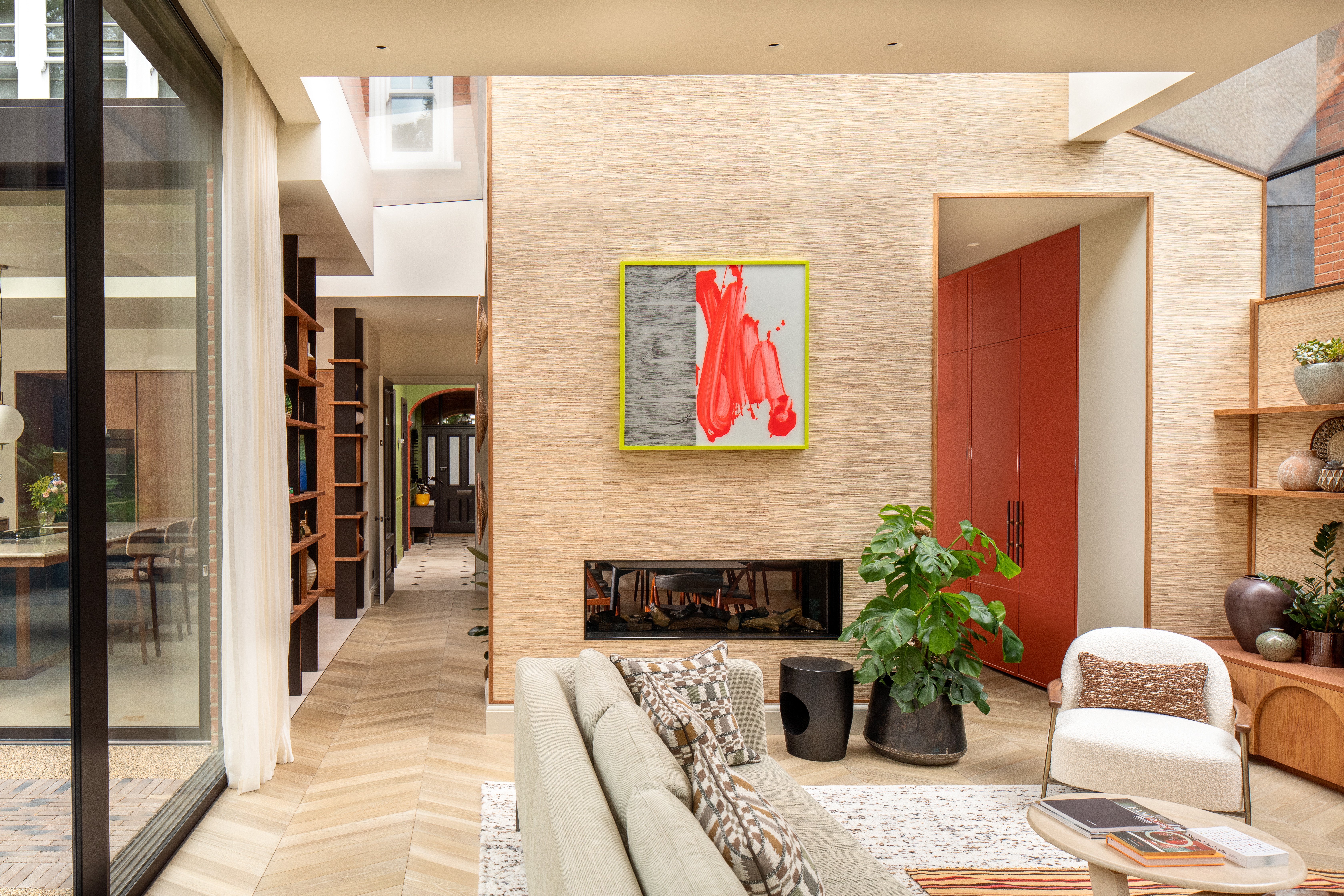
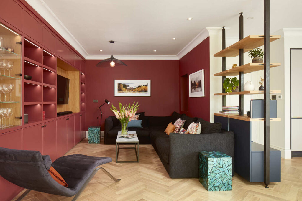
Colour is more than decoration, it guides the way we experience and interact with a space. At XUL, we design spaces with wellbeing in mind, and colour is one of our most powerful tools. The right palette can calm or energise, open or contain, and even change how we perceive temperature, time, and comfort.
At a Glance:
- Colour affects mood, cognition, and behaviour.
- Hue, lightness, and chroma each shape how colour is experienced.
- Nature-inspired tones promote calm and focus.
- Warm and cool colours influence how we perceive temperature and time.
- Reflectivity and contrast impact brightness, comfort, and attention.
What exactly is colour?
When light enters the eye, it stimulates specialised cells called cones, which respond to different wavelengths and send information to the brain’s visual cortex (Li et al., 2022). This process shapes how we interpret hue, lightness, and chroma, the three essential properties of colour.
- Hue refers to the colour family, such as red, blue, or green.
- Lightness describes how bright or dark a colour appears, influencing contrast and spatial clarity.
- Chroma measures intensity – whether a tone feels vivid or muted.
Together, these properties determine how colour interacts with emotion, attention, and perception.
Why are natural colours so calming?
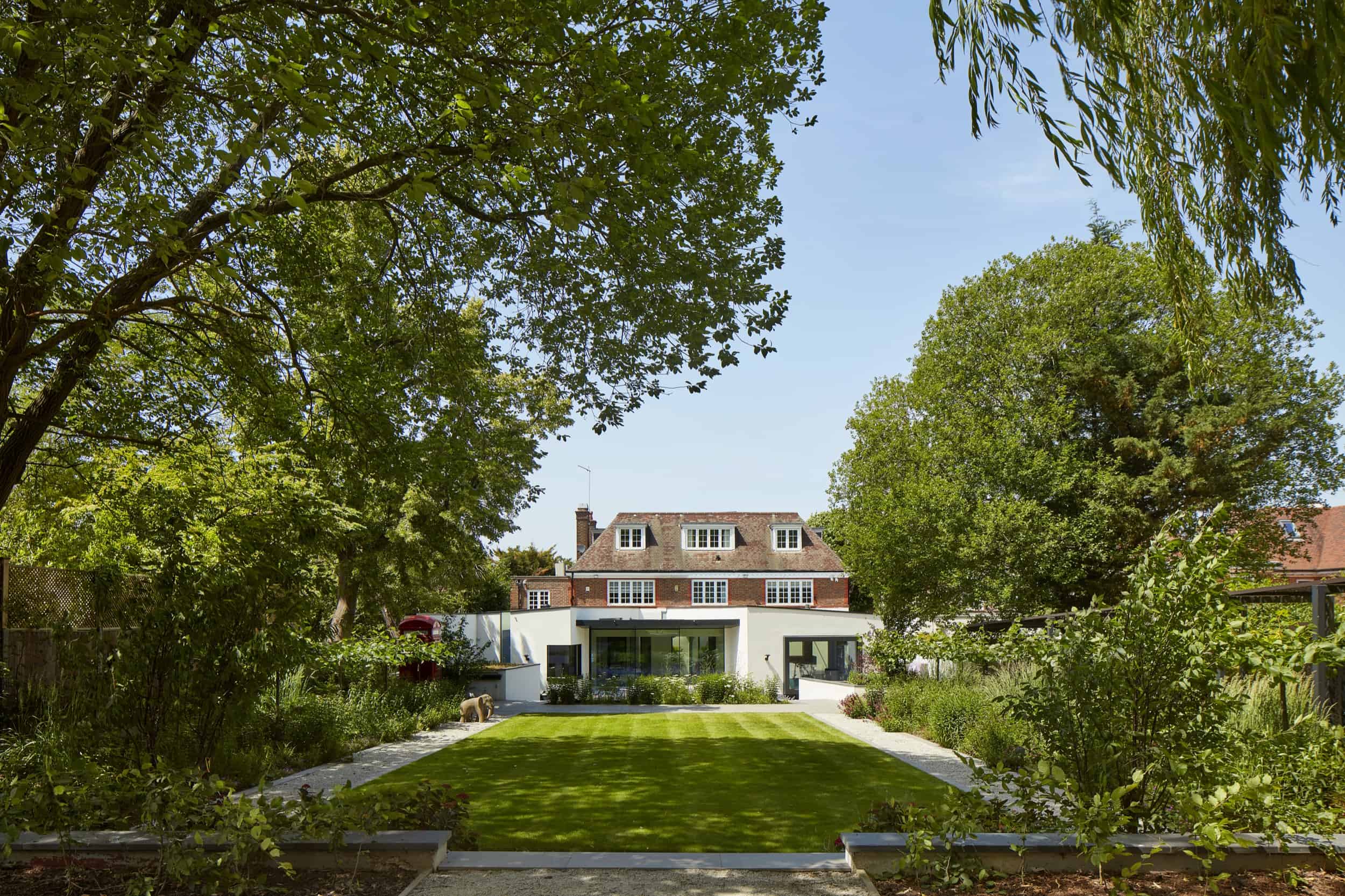
Humans have an instinctive connection to nature, and biophilic design uses this to promote wellbeing. Incorporating greens, blues, and earthy tones can trigger feelings of peace and balance (Sjövall & Spiers, 2024).
Research shows that simply walking in a green environment lowers heart rate, demonstrating the soothing power of natural colours (Briki & Majed, 2019). A large-scale review of over a century of studies found that nature colours consistently evoke comfort, serenity, and relaxation (Jonauskaite & Mohr, 2025).
In design, this means aligning colour choices with the room’s purpose; soft greens for calm and focus, or more playful hues in social spaces to encourage energy and connection.
Can colour change how warm or cold a space feels?
Yes – even if the actual temperature doesn’t change. According to the hue–heat hypothesis, reds and yellows make a room feel warmer, whilst blues and greens make it feel cooler (Hammond et al., 2024).
Colour can even alter how we experience time. In one study, people in blue-toned rooms believed that time passed faster than it actually did, whereas red rooms made time seem slower (Thönes et al., 2018). Brighter spaces can also give the impression of expanded time and space (Kinzuka et al., 2022).
How does colour affect concentration and comfort?
The reflectivity of a colour changes how light behaves in a space. Bright surfaces bounce light around and create a sense of openness, whilst darker tones absorb light and make a space feel more enclosed. This makes colour choice especially important where daylight is limited; light, reflective finishes can amplify brightness without unnecessary harshness.
Whilst white serves as a versatile neutral backdrop, too much white can lead to glare and visual fatigue, particularly in well-lit rooms. This has been demonstrated by research that shows students to perform better in chromatic environments (with colour), rather than in all-white settings (Liew et al., 2022). Cooler hues have also been shown to boost focus and memory in learning environments (Llinares et al., 2021).
Why does contrast matter?
Contrast is defined by how colours interact with each other and with light, and it helps the brain make sense of space. High-contrast combinations draw attention to architectural details and can make unfamiliar environments feel more intuitive (Min & Lee, 2020).
Conversely, darker interiors can subtly increase arousal and heart rate, creating warmth and intimacy (Weijs et al., 2023). In practice, this means that the same colour can create very different experiences depending on its surroundings.
Final Thoughts
Colour bridges the gap between how we see and how we feel, shaping our everyday experiences. It influences how we feel, focus, and connect with the spaces around us. By designing with intention and considering hue, lightness, and chroma in relation to natural light, function, and atmosphere, we can transform spaces into places that feel balanced, inviting, and supportive.
References
Briki, W., & Majed, L. (2019). Adaptive effects of seeing green environment on psychophysiological parameters when walking or running. Frontiers in Psychology, 10, 252. https://doi.org/10.3389/fpsyg.2019.00252
Hammond, B. R., Gardner, C. R., Wooten, B. R., & others. (2024). Increasing intensity directly increases the perceived warmth of primary colors. Scientific Reports, 14, 26852. https://doi.org/10.1038/s41598-024-77942-1
Jonauskaite, D., & Mohr, C. (2025). Do we feel colours? A systematic review of 128 years of psychological research linking colours and emotions. Psychonomic Bulletin & Review. https://doi.org/10.3758/s13423-024-02615-z
Kinzuka, Y., Sato, F., Minami, T., & Nakauchi, S. (2022). The effect of red/blue color stimuli on temporal perception under different pupillary responses induced by different equiluminant methods. PLoS ONE, 17(6), e0270110. https://doi.org/10.1371/journal.pone.0270110
Liew, T. W., & Tan, S. M. (2022). Colors and learner’s gender evoke different emotional and cognitive effects in multimedia learning. Human Behavior and Emerging Technologies, 2022, Article ID 1235732. https://doi.org/10.1155/2022/1235732
Li, P., Garg, A. K., Zhang, L. A., Rashid, M. S., & Callaway, E. M. (2022). Cone opponent functional domains in primary visual cortex combine signals for color appearance mechanisms. Nature Communications, 13(1), 6344. https://doi.org/10.1038/s41467-022-34020-2
Llinares, C., Higuera-Trujillo, J. L., & Serra, J. (2021). Cold and warm coloured classrooms: Effects on students’ attention and memory measured through psychological and neurophysiological responses. Building and Environment, 196, 107726. https://doi.org/10.1016/j.buildenv.2021.107726
Min, Y. H., & Lee, S. (2020). Does interior color contrast enhance spatial memory? Color Research & Application, 45(2), 352–361. https://doi.org/10.1002/col.22481
Sjövall, I., & Spiers, H. (2024). The potential of biophilic design and nature to improve health, creativity and well-being. In Biophilic Design and the Built Environment (pp. Chapter 11). Springer. https://doi.org/10.1007/978-3-031-64699-7_11
Thönes, S., von Castell, C., Iflinger, J., & others. (2018). Color and time perception: Evidence for temporal overestimation of blue stimuli. Scientific Reports, 8, 1688. https://doi.org/10.1038/s41598-018-19892-z
Weijs, M. L., Jonauskaite, D., Reutimann, R., Mohr, C., & Lenggenhager, B. (2023). Effects of environmental colours in virtual reality: Physiological arousal affected by lightness and hue. Royal Society Open Science, 10, 230432. https://doi.org/10.1098/rsos.230432